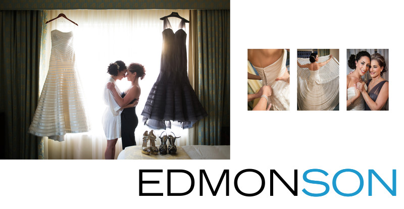
Wedding Albums: Cover Materials, Options & Style
The purpose of this article is to provide you an overview of the different materials, styles, and options to choose your perfect wedding album cover. We've created this guide to make the process easy and straightforward.
Imaginging your perfect wedding album?
>> Discover how to tell the perfect love story.
>> Be inspired by creative real world examples.
4 Easy Steps To Choosing Your Wedding Album Cover
- Pick a cover material i.e. Leather, Silk, Faux Leather, etc.
- Decide if you want a Photo Front Cover, Cover Motif w/Photo or without, or Embossing
- Share with us how you'd like your names to appear, i.e., Jack and Jill or Jill + Jack.
- Confirm your wedding date and format. ie. January 21st, 2016 or 01/21/2016
Cover Materials
The material you select is one of the most "personal" decisions you will make. The type of cover material and it's available colors reflects your style and is the first impression people will have when looking at your wedding album. How the material feels to the touch gives them additional insight before they even crack it open.
There is a wide variety of different materials, colors and options to choose from, and you can see them in more detail in our swatch gallery.
You might select something based on the colors of your wedding or choose something that reflects your home decor. Or maybe, you pick something that expresses who you are as a couple. Whatever you decide, we want it to be perfect for you!
- Classic Leathers
- Contemporary Leathers
- Micro Leathers
- Metallic Faux Leathers
- Distressed Faux Leathers
- Pearlised Faux Leathers
- Japanese Bookbinding Silks
- Classic Library Buckrams
Here are the different types of cover materials and their available colors.
Note: our album company provided helpful descriptions at the top that shares their thoughts about the different materials. We've also provided additional insight into how we think they feel.
Cover Materials
Classic Leathers
Classic Genuine Leathers are supreme quality top grain leather from Europe's leading leather supplier. Produced from the finest hides, soft to the touch, with occasional markings that prove their natural, pastoral origins.
"It feels like an excellent, regular leather. You can feel and see the texture of the leather. Exactly what you would expect out of something called "Classic Leather."
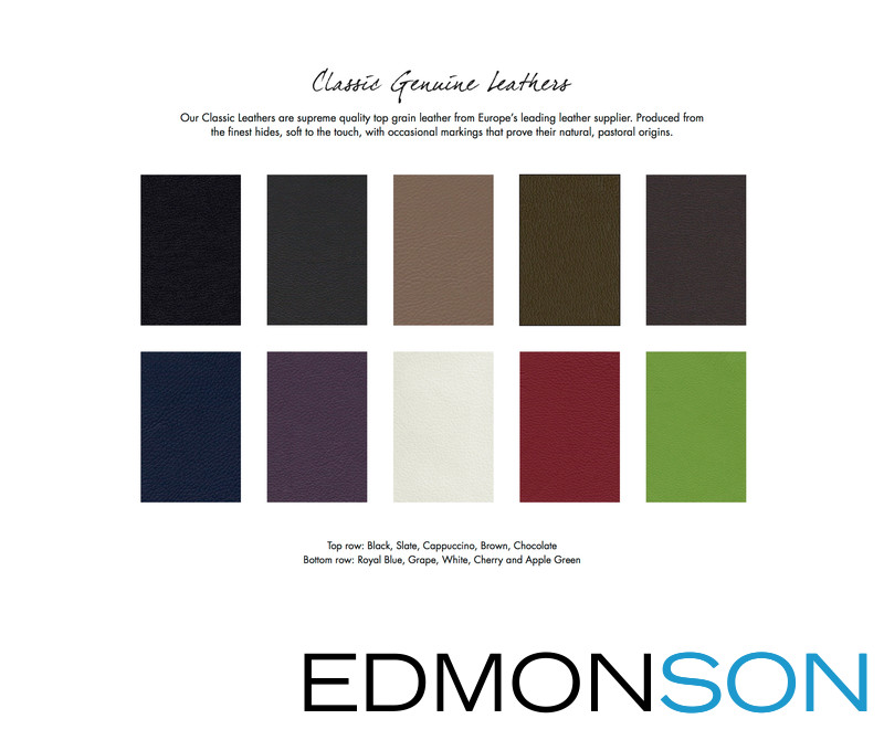
Top row: Black, Slate, Cappucino, Brown, Chocolate
Bottom row: Royal Blue, Grape, White, Cherry, and Apple Green
Contemporary Genuine Leathers
Contemporary Leathers are specially made by one of France's oldest and finest artisan tanneries, whose clients include the most famous luxury houses of Europe.
"Feels the softest and you can definitely feel the texture. Almost like suede."
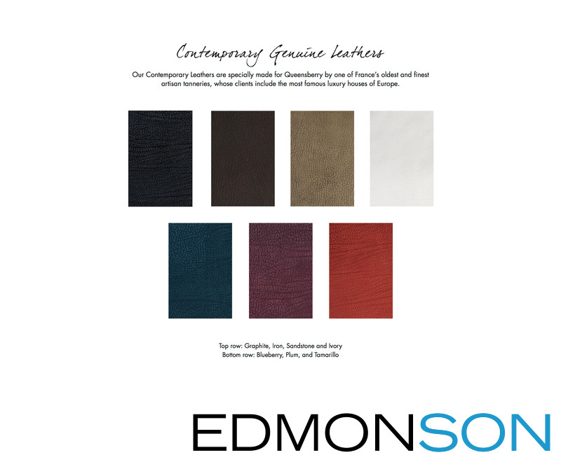
Top row: Graphite, Iron, Sandstone, and Ivory
Bottom row: Blueberry, Plum, and Tamarillo
Micro Leathers
The man-made Micro Leathers are chosen not only for their beauty, touch, and durability but also for the environmentally responsible policies of their manufacturer, with no heavy metals, formaldehyde, etc used in their production. Vegan-friendly.
"It feels quite like a luxurious "worked" leather. The is only a light feeling of texture. Somewhere between the Classic and Contemporary. Almost like an Italian purse."
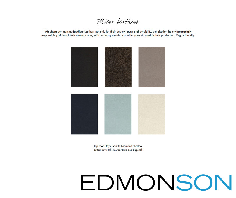
Top row: Onyx, Vanilla Bean*, and Shadow
Bottom row: Ink, Powder Blue, and Eggshell
* Vanilla Bean cannot be embossed.
Distressed Faux Leathers
Vintage '60's. The times were definitely changing with the summer of love, the hippie movement, flower power and all things hand-made. These distressed man-made leathers evoke a simpler time when nature and natural style ruled. Vegan-friendly.
"Feels solid. Not as soft as Micro Leather, with a familiar feeling of texture. Feels very tight or secure - like whatever wrapped inside it would be perfectly snug."
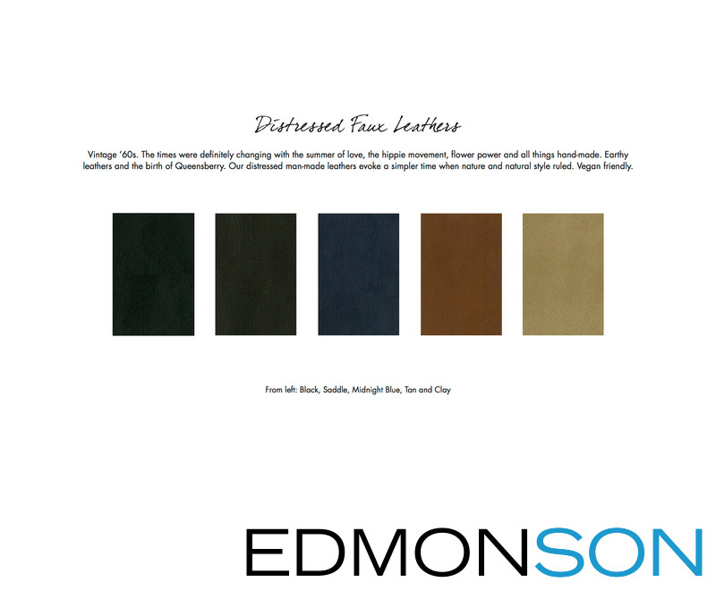
From left: Black, Saddle, Midnight Blue, Tan, and Clay
Metallic Faux Leathers
These man-made metallic leathers are soft to the touch with a contemporary metallic finish. Vegan-friendly.
"Feels softer than the Distressed Faux Leather, smoother in finish."
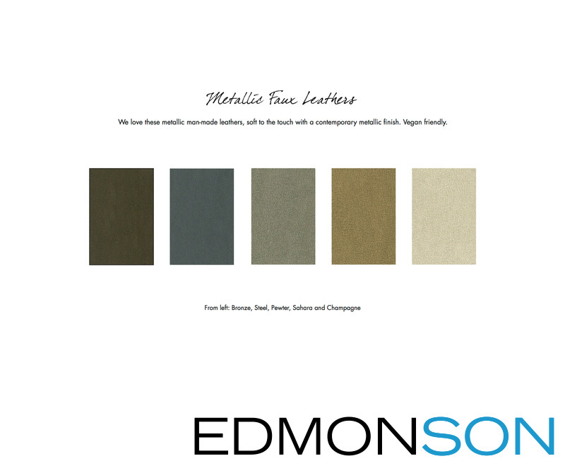
From left: Bronze, Steel, Pewter, Sahara, and Champagne
Pearlised Faux Leathers
'50's nostalgia through and through. Homemade apple pie, pretty-as-a-picture cupcakes, gingham skirts and the birth of Rock 'n' Roll. Feel the '50's with these glazed and slightly pearlised man-made leathers in delicious pastel colors. Vegan-friendly.
"You can feel the glazed finish, but it's not quite patent leather. Again, almost like an Italian purse."
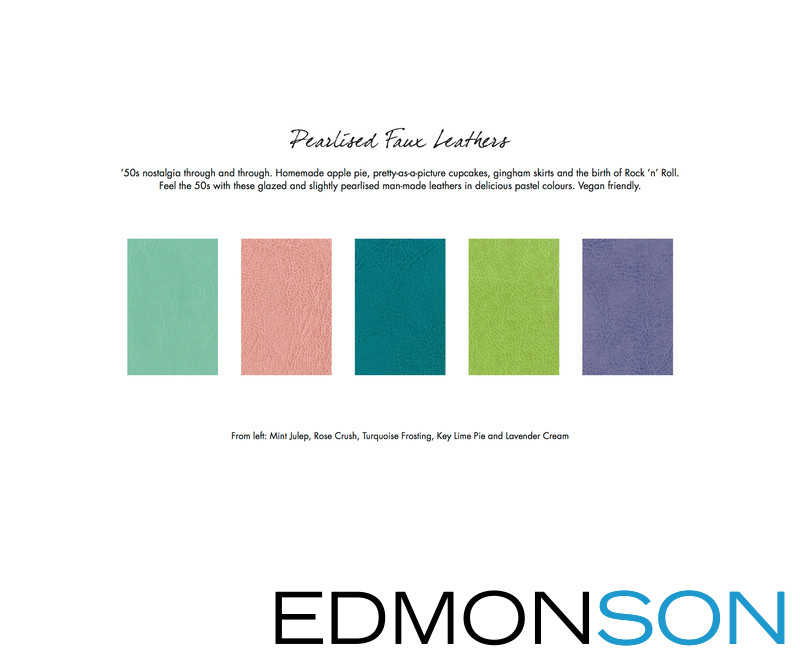
From left: Mint Julep, Rose Crush, Turquoise Frosting, Key Lime Pie, and Lavender Cream
Japanese Bookbinding Silks
These beautiful Silks are sourced from Japan's finest silk mills.
"Feels good to your hands. Just enough tooth without feeling masculine. Doesn't seem fragile."
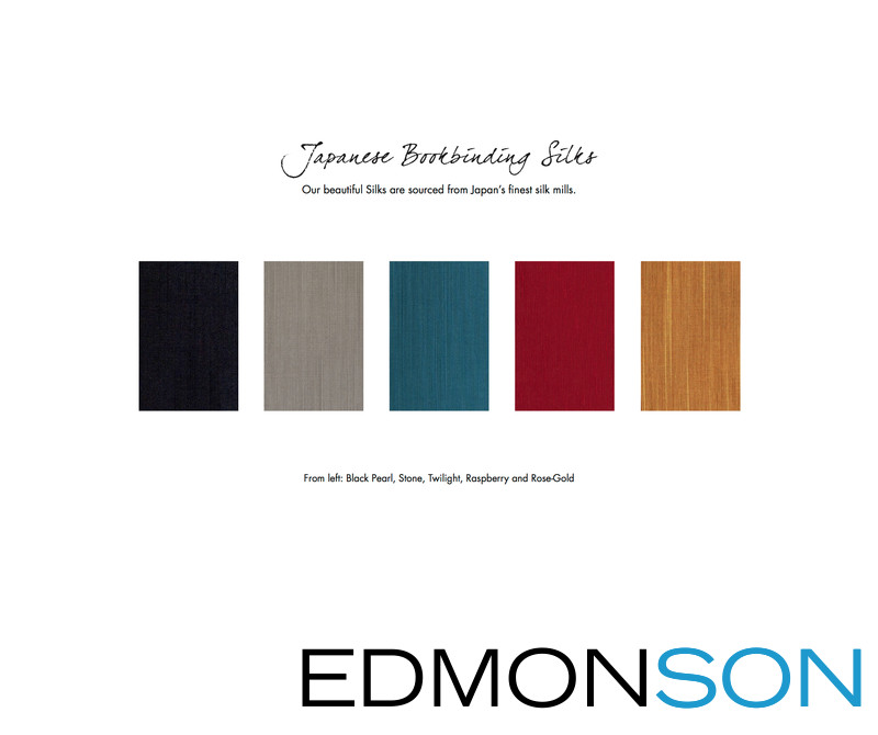
From left: Black Pearl, Stone, Twilight, Raspberry, and Rose-Gold
Buckram
Buckram has been the choice of publishers and libraries for generations, offering beauty, quality, and durability. These European buckrams emboss beautifully.
"Feels like fine texture and durable build quality. It invokes more or a hardback textbook finish or feeling. It provides a comparable amount of protection for your wedding album to Leather but loses some of the tactile sensory appeal."
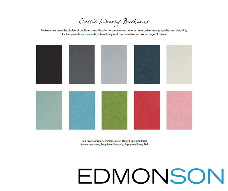
Top row: Carbon, Gunmetal, Silver, Starry Night, and Pearl
Bottom row: Mint, Baby Blue, Pistachio, Poppy, and Pretty Pink
3 Ways To Customize Your Cover
There are 3 different ways you can customize your cover, to make it's presentation perfect for you. There is something very appealing and elegant by using embossing or cover motif. We feel that with its smaller footprint that it has a timeless feeling. Ultimately if you'd like a photo on the front, there is no right or wrong. This wedding album is yours after all!
- Cover Photo - Choose either a Full or 1/2 photo front
- Cover Motif - Choose either Black or White with Text or Photo with Text
- Embossing - Names Only or Names & Date in Futura or Bank Gothic font
Our Thoughts On Photo Front Covers
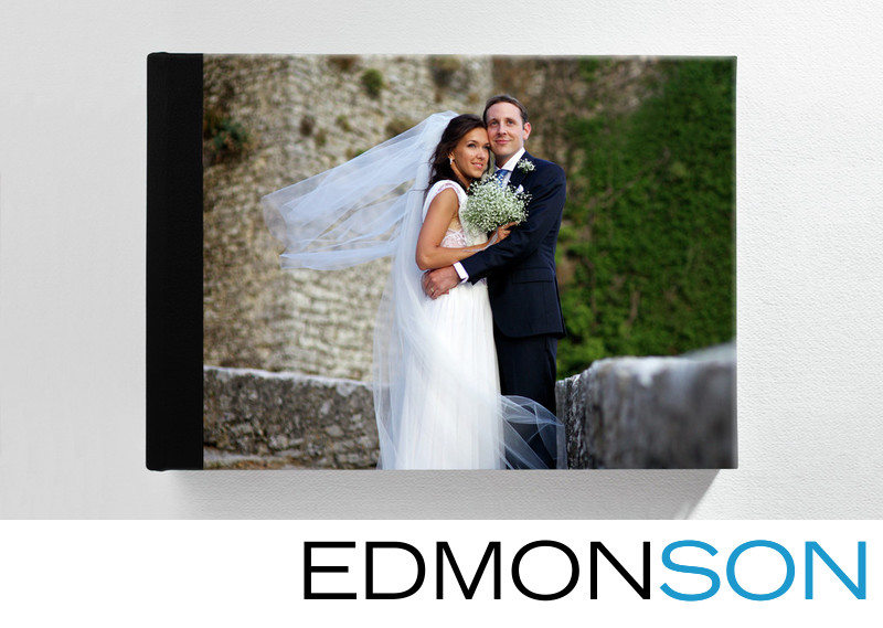
Photo front covers are an excellent way to showcase your favorite wedding photo or create a custom look. Often, that personal favorite may also be inside the album, but it doesn't have to be. You might even use it on the first side to introduce your album. We have custom approaches that can make your photo front cover look unique. Merely let us know and we are happy to send you some more examples to see.
* Note: The photos shown here are not ours - they are ones provided by the album company.
Full Cover Photo
Half Cover Photo
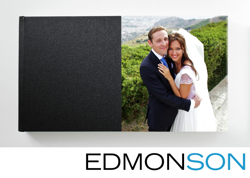
If you would like to have a photo front cover, the next decision is if it spans the Full width or just Half, and which photo you'd like to use. When picking, consider the orientation of the image as placing a vertical photo inside a horizontal space may result in cropping out parts of the picture.
Our Thoughts On Cover Motif's
Many of our sample albums feature the beautiful simplicity of the text only cover motif. Of course, you can also include a photo. Our personal preference is not to add one. Mainly because often your favorite photo is used as the first thing is seen when opening the album.
If you are considering a cover motif WYSIWYG, the examples shown are very literal. A Square Photo w/Text fills the frame. If you want White Frame Photo w/Text, there is some space around the picture which is square and the names and date below it. We like the Square shape because it feels like a proper size, that's not too small and not too big.
Cover Motif Options
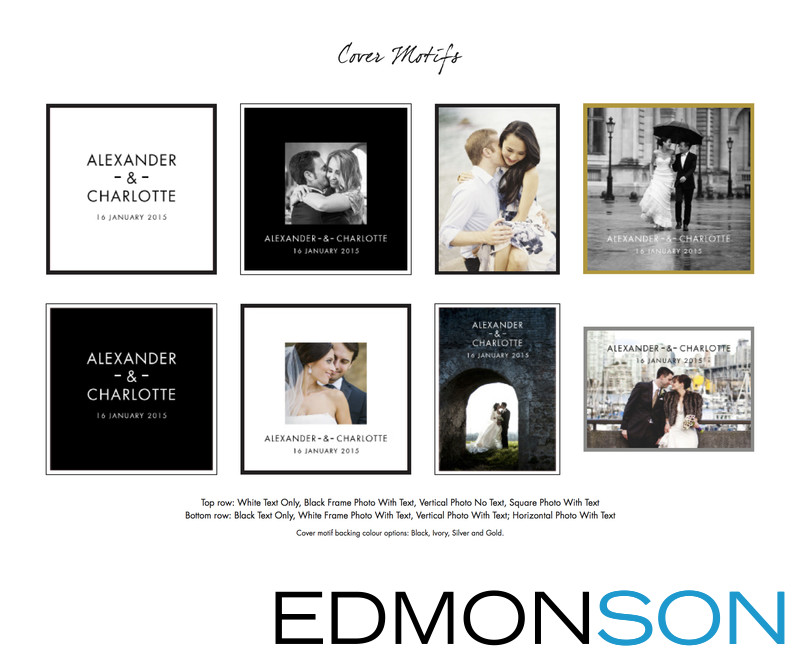
Top row: White Text Only, Black Frame Photo With Text, Vertical Photo No Text, and Square Photo With Text
Bottom row: Black Text Only, White Frame Photo With Text, Vertical Photo With Text, and Horizontal Photo With Text
Cover motif backing color options, Black, Ivory, Silver, and Gold
Text Only Black Cover Motif With Ivory Border
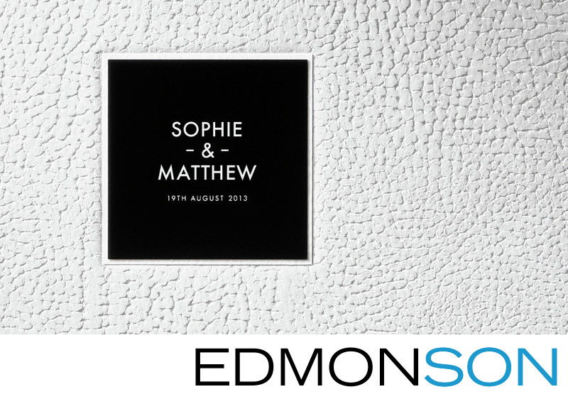
Photo Only Cover Motif
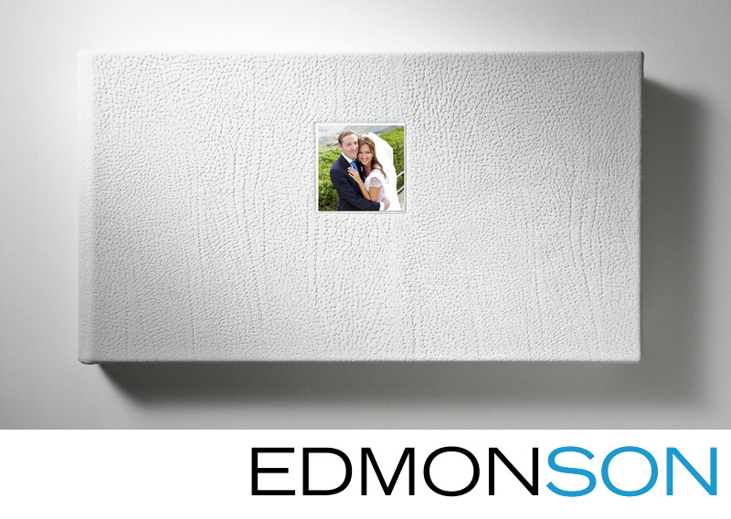
Choosing a horizontal or vertical motif works best when it matches the corresponding album shape. Placing a vertical motif in a horizontal layout may look small or "funny" to the eye.
One of the ways you can accent your motif is the color of the backing material. Notice in the example of the White Text Only the Black "Border" around it...that's called the backing.
High contrast like the black border around White Motif or the reverse works well if you'd like the motif to stand out and draw the eye. The difference provides a frame and is probably most attractive to someone who likes a more artistic design style.
Matching the colors of the backing and the motif i.e. Black border around Black Motif blends the everything into the overall cover like a single piece. It's a very elegant, classic and sophisticated approach most attractive to clients who love clean lines and details.
Matching the values close to your cover material accentuates this feeling, i.e., a brighter cover material with a white motif and border has a light, airy feeling.
Darker cover materials with a black border and black motif maintain the overall strength and weight of the cover. It's like when you see a car with all black detailing - very hip and chic!
Finally, some colored backing materials work best when you choose something analogous or complementary. As an example, let's say you like the Rose Gold Silk with a White Motif. Having a Gold backing material can be the perfect final touch!
Our Thoughts On Embossing
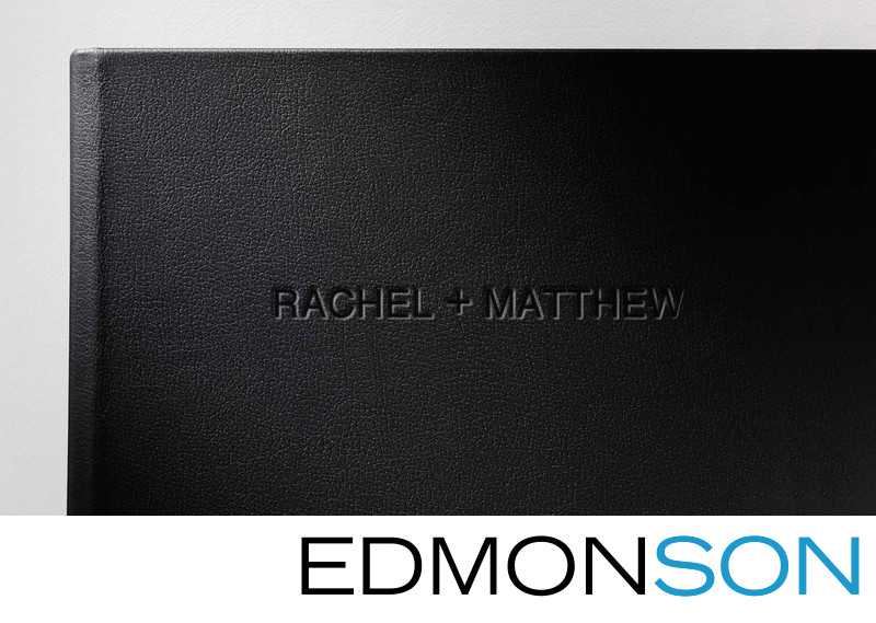
There is something wonderful about the understated simplicity of a beautiful album with embossing. The embossed names maintain the visual integrity of the cover creating a feeling of it being a part of rather than an additional design element.
You can emboss names or your names and the date. When choosing, be aware that inside your album is a transparent vellum material with your names and date printed on it.
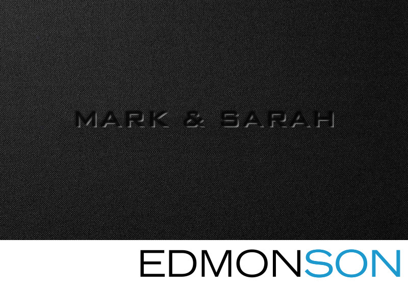
There are two fonts to choose from Futura and Bank Gothic. Our preference leans towards the clean lines of the Futura. There are a few materials that can't take embossing, mainly Silks, and the Vanilla Bean Micro Leather.
Futura Embossing
Bank Gothic EmBossing
Deciding whether to emboss your name only or both names and dates is a preference vs. a right or wrong thing. Your names personalize the story about the two of you.
Including both your names and dates provides a bit more context of when the story unfolded. There is a stylistic choice to make whether you use the & or the + sign as the separator i.e. Jack & Jill or Jack + Jill.
A logical question is whose name goes first? Traditionally, or on a wedding invitation, the bride's name is first and then the grooms. Maybe the way your names flow makes a difference to you. Ultimately, that decision is up to you as a couple.
Date Format
There are options to show your wedding date numerically or written out according to your tastes or region.
Examples are January 21st, 2016, January 21, 2016, 1/21/2016 or 21/1/2016.
International clients typically prefer the formatting of Day/Month/Year.
Recapping Your Wedding Album Cover Options
Here is what we need to know from you to complete you album order.
Choice of Cover Material, i.e., Rose Gold Silk or Black Onyx Micro Leather
How you'd like it personalized, i.e., Cover Photo, Cover Motif or Embossing.
What is the photo you'd like used or what Font for embossing and separator, i.e., & or +
How you'd like your names to appear inside on the vellum and/or outside on the cover, i.e., Jack and Jill or Jill + Jack.
Confirm your wedding date and how you would like the formatting. ie. January 21st, 2016 or 01/21/2016.
Copyright 2002-2024 David & Luke Edmonson All Rights Reserved.
All photographs and content appearing on this site are the property of the Edmonson's. They are protected by U.S. Copyright Laws, and are not to be downloaded or reproduced in any way without our written permission. You may share photos using the tools provided in our galleries.
Edmonson Photography is based out the Dallas - Ft. Worth Metroplex, Texas.
Check Availability | 11134 Candlelight Lane, Dallas, TX 75229 | (972) 208-0215
